


Table of contents
- Introduction
- Prerequisites
- Step 1 - Insert the Profile Picture
- Step 2 - Populate the Profile Menu
- Step 3 - Extend the Functionality: Use Profile Preamble
- Step 4 - Extend the Functionality: Use Profile Component
- Step 5 - Hide or Re-use the Sign In Button
- Step 6 - Handle callbacks
- Step 7 - Styling
- Reference Links
- Video Tutorial
- Further Reading
- Conclusion
Introduction
This article shows you how to insert the profile information of any user into the react navigation bar, so as to make it sign-in aware. It shows you how to insert and configure the profile picture & menu, how to reuse the sign in button, how to handle callbacks and then it will discuss the styling.
Prerequisites
This article assumes that you have read the previous navbar tutorials. In case you haven't you will find a consolidated list in the reference links section. This article assumes that you have installed the Superflows library, have the default navigation bar up and running, have added your brand information, have also customised your menu, have added the search input and have also configured the sign in button. This tutorial takes it forward from there.
Step 1 - Insert the Profile Picture
To show the profile picture, set the showProfile prop to true and set the profile picture url string to the profilePicture prop.
return (
        <div>
                <SfNav showProfile={true} profilePicture='https://i.pinimg.com/736x/7f/79/6d/7f796d57218d9cd81a92d9e6e8e51ce4--free-avatars-online-profile.jpg' />
        </div>
);
It renders as follows:


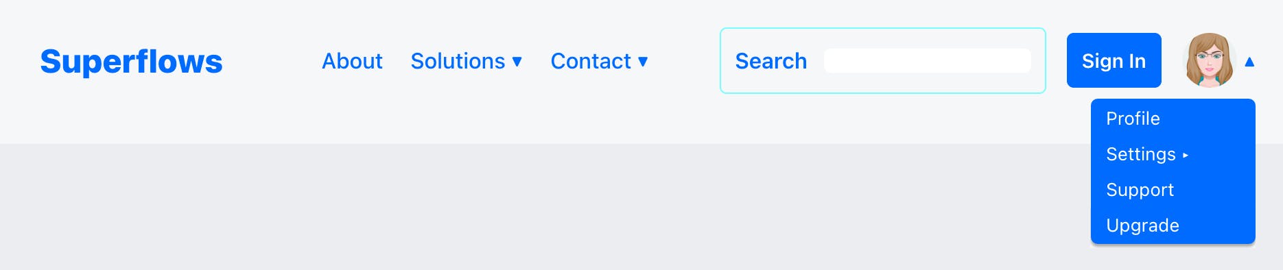
Step 2 - Populate the Profile Menu
Profile menu can be populated by passing the requisite json array object to the profileMenu prop. I am showing an example here. You can look at how the json array object has been composed.
return (
        <div>
                <SfNav
                  showProfile={true}
  profilePicture='https://i.pinimg.com/736x/7f/79/6d/7f796d57218d9cd81a92d9e6e8e51ce4--free-avatars-online-profile.jpg'
                  profileMenu={[{caption: "Profile", link: "profile"}, [{caption: "Settings", link: "support"}, {caption: "Notifications", link: "notifications"}, {caption: "Privacy", link: "privacy"}], {caption: "Support", link: "support"}, {caption: 'Upgrade', link: "upgrade"}]}
                />
        </div>
);
It renders as follows:

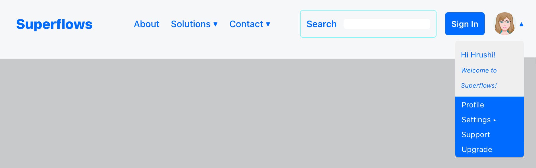
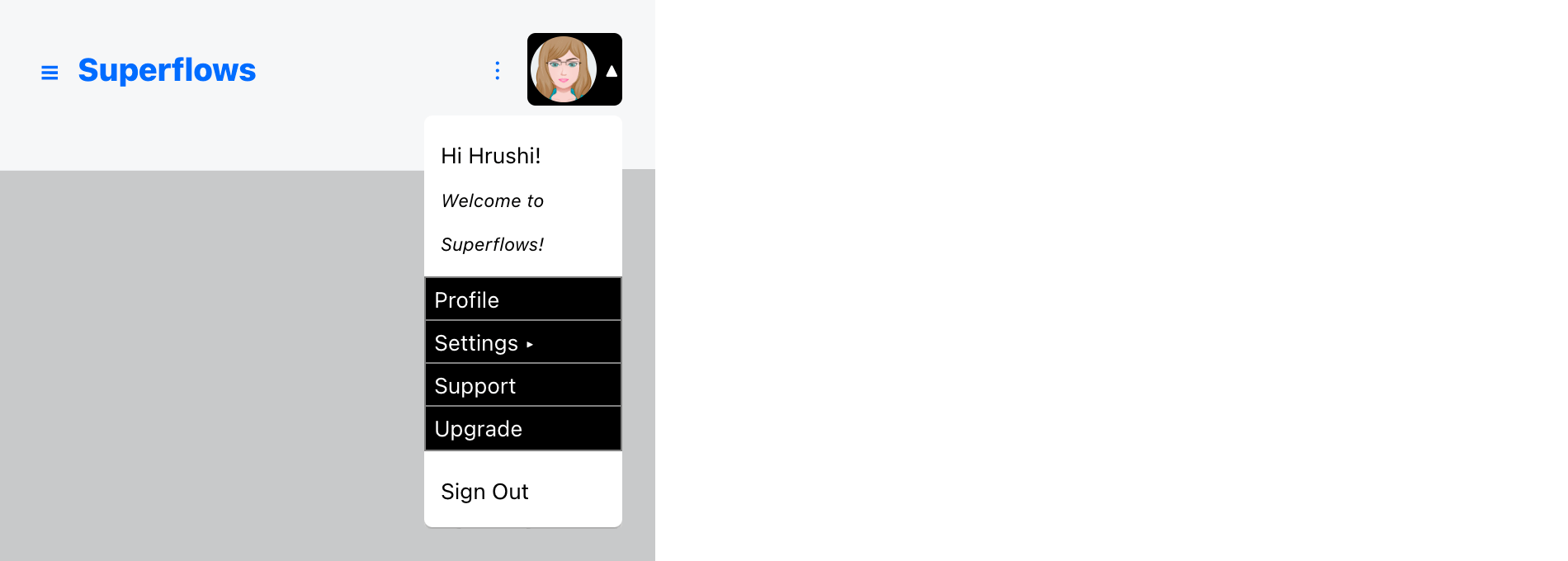
Step 3 - Extend the Functionality: Use Profile Preamble
The navigation bar provides you a container, just above the profile menu, where you can insert your own custom developed component. It is called the profile preamble. How to use it, is totally up to your imagination. In the example shown below, it provides some profile context to the user.
return (
        <div>
                <SfNav
                  showProfile={true}
  profilePicture='https://i.pinimg.com/736x/7f/79/6d/7f796d57218d9cd81a92d9e6e8e51ce4--free-avatars-online-profile.jpg'
                  profileMenu={[{caption: "Profile", link: "profile"}, [{caption: "Settings", link: "support"}, {caption: "Notifications", link: "notifications"}, {caption: "Privacy", link: "privacy"}], {caption: "Support", link: "support"}, {caption: 'Upgrade', link: "upgrade"}]}
                  profilePreamble={<div style={{width: '100%', paddingTop: '10px', paddingBottom: '10px', paddingLeft: '10px', paddingRight: '10px'}}><small>Hi Hrushi!</small><br /><small><small><i>Welcome to Superflows!</i></small></small></div>}
                />
        </div>
);
It renders as follows:
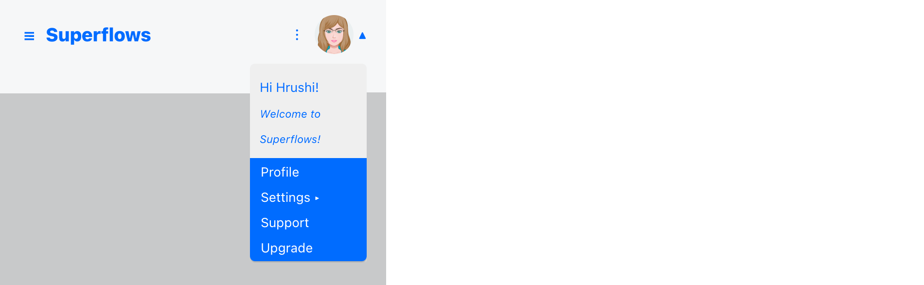
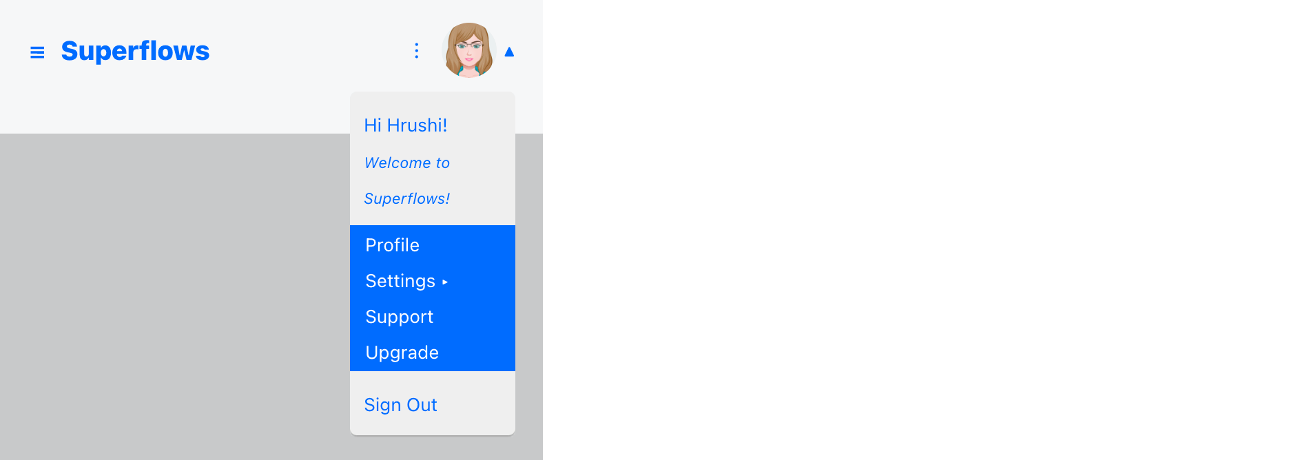
Step 4 - Extend the Functionality: Use Profile Component
The navigation bar provides you a second container, just below the profile menu, where you can insert another custom developed component. It is called the profile component. How to use it, is totally up to your imagination. In the example shown below, it show a sign out button.
return (
        <div>
                <SfNav
                  showProfile={true}
  profilePicture='https://i.pinimg.com/736x/7f/79/6d/7f796d57218d9cd81a92d9e6e8e51ce4--free-avatars-online-profile.jpg'
                  profileMenu={[{caption: "Profile", link: "profile"}, [{caption: "Settings", link: "support"}, {caption: "Notifications", link: "notifications"}, {caption: "Privacy", link: "privacy"}], {caption: "Support", link: "support"}, {caption: 'Upgrade', link: "upgrade"}]}
                  profilePreamble={<div style={{width: '100%', paddingTop: '10px', paddingBottom: '10px', paddingLeft: '10px', paddingRight: '10px'}}><small>Hi Hrushi!</small><br /><small><small><i>Welcome to Superflows!</i></small></small></div>}
                  profileComponent={<div style={{width: '100%', paddingTop: '10px', paddingBottom: '10px', paddingLeft: '10px', paddingRight: '10px'}}><small>Sign Out</small></div>}
                />
        </div>
);
It renders as follows:
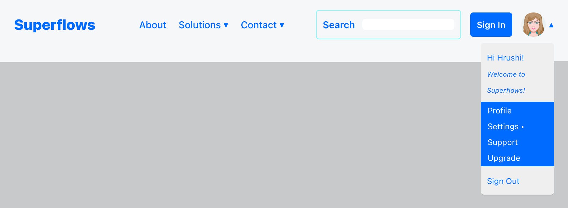
Step 5 - Hide or Re-use the Sign In Button
User profile information is displayed usually only for the signed in user. In such a scenario, the sign in button is not necessary. You can either hide it or re-use it. The following example, re-uses it as a subscription button.
return (
        <div>
                <SfNav
                  showProfile={true}
  profilePicture='https://i.pinimg.com/736x/7f/79/6d/7f796d57218d9cd81a92d9e6e8e51ce4--free-avatars-online-profile.jpg'
                  profileMenu={[{caption: "Profile", link: "profile"}, [{caption: "Settings", link: "support"}, {caption: "Notifications", link: "notifications"}, {caption: "Privacy", link: "privacy"}], {caption: "Support", link: "support"}, {caption: 'Upgrade', link: "upgrade"}]}
                  profilePreamble={<div style={{width: '100%', paddingTop: '10px', paddingBottom: '10px', paddingLeft: '10px', paddingRight: '10px'}}><small>Hi Hrushi!</small><br /><small><small><i>Welcome to Superflows!</i></small></small></div>}
                  signInCaption="Subscribe"
                />
        </div>
);
It renders as follows:

Step 6 - Handle callbacks
To listen to the click event on the profile menu, subscribe to the onMenuClicked prop as shown. To listen to the click event on the subscribe (re-used sign in) button, subscribe to the onSignInPressed prop as shown below:
return (
        <div>
                <SfNav
                  showProfile={true}
  profilePicture='https://i.pinimg.com/736x/7f/79/6d/7f796d57218d9cd81a92d9e6e8e51ce4--free-avatars-online-profile.jpg'
                  profileMenu={[{caption: "Profile", link: "profile"}, [{caption: "Settings", link: "support"}, {caption: "Notifications", link: "notifications"}, {caption: "Privacy", link: "privacy"}], {caption: "Support", link: "support"}, {caption: 'Upgrade', link: "upgrade"}]}
                  profilePreamble={<div style={{width: '100%', paddingTop: '10px', paddingBottom: '10px', paddingLeft: '10px', paddingRight: '10px'}}><small>Hi Hrushi!</small><br /><small><small><i>Welcome to Superflows!</i></small></small></div>}
                  profileComponent={<div style={{width: '100%', paddingTop: '10px', paddingBottom: '10px', paddingLeft: '10px', paddingRight: '10px'}}><small>Sign Out</small></div>}
                  signInCaption="Subscribe"
                  onMenuClicked={(value)=>{alert(value)}}
                  onSignInPressed={()=>{alert('Subscribe pressed!')}}
                />
        </div>
);
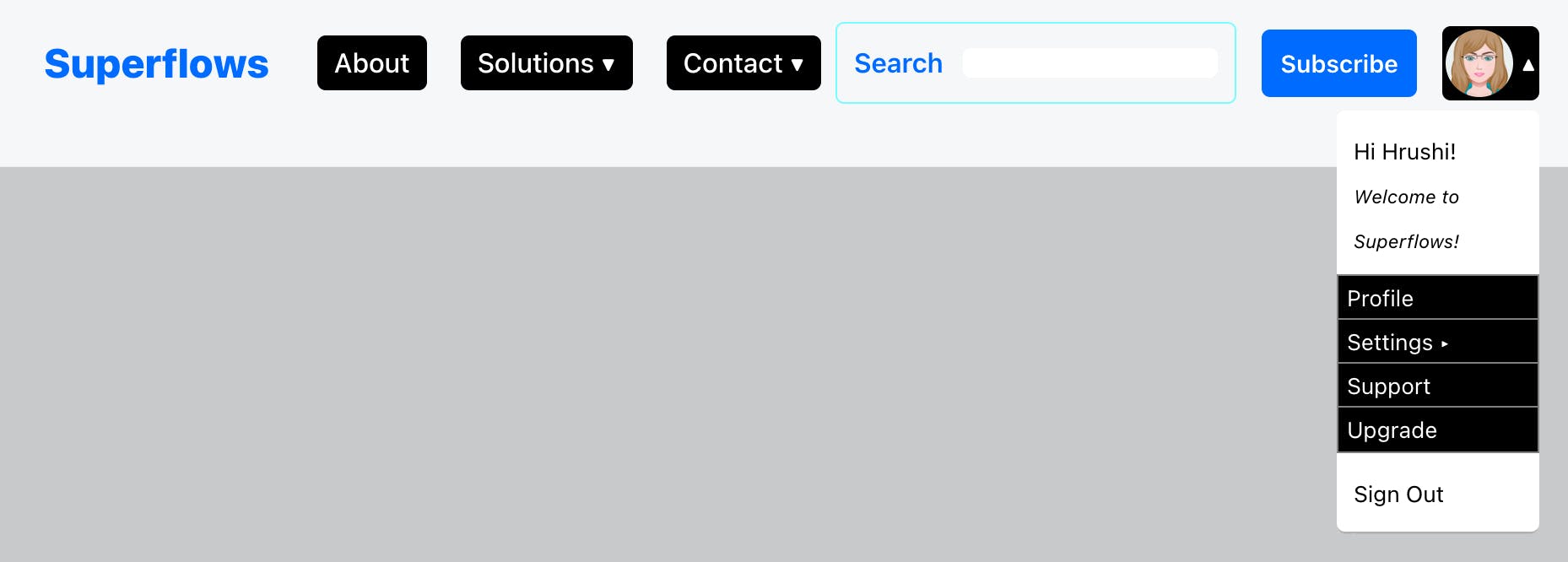
Step 7 - Styling
You can then customise the look and feel, by using inline css or by class names. The Superflows navigation bar exposes props that facilitate customisation. An example is shown below:
return (
        <div>
                <SfNav
                  showProfile={true}
  profilePicture='https://i.pinimg.com/736x/7f/79/6d/7f796d57218d9cd81a92d9e6e8e51ce4--free-avatars-online-profile.jpg'
                  profileMenu={[{caption: "Profile", link: "profile"}, [{caption: "Settings", link: "support"}, {caption: "Notifications", link: "notifications"}, {caption: "Privacy", link: "privacy"}], {caption: "Support", link: "support"}, {caption: 'Upgrade', link: "upgrade"}]}
                  profilePreamble={<div style={{width: '100%', paddingTop: '10px', paddingBottom: '10px', paddingLeft: '10px', paddingRight: '10px'}}><small>Hi Hrushi!</small><br /><small><small><i>Welcome to Superflows!</i></small></small></div>}
                  profileComponent={<div style={{width: '100%', paddingTop: '10px', paddingBottom: '10px', paddingLeft: '10px', paddingRight: '10px'}}><small>Sign Out</small></div>}
                  signInCaption="Subscribe"
                  onMenuClicked={(value)=>{alert(value)}}
                  onSignInPressed={()=>{alert('Subscribe pressed!')}}
                  stylesProfilePictureContainer={
                        {backgroundColor: 'black', padding: '2px', color: 'white', borderRadius: '5px'}
                      }
                      stylesProfilePreamble={
                        {backgroundColor: 'white', color: 'black'}} stylesProfileComponent={{backgroundColor: 'white', color: 'black'}
                      }
                      stylesMenu={
                        {backgroundColor: 'black', color: 'white', paddingTop: '3px', paddingBottom: '3px', paddingLeft: '10px', paddingRight: '10px', borderRadius: '5px'}
                      }
                      stylesSubMenu={
                        {backgroundColor: 'black', color: 'white', paddingLeft: '5px', paddingRight: '5px', border: 'solid 1px gray'}
                      }
                      stylesMenuMobile={
                        {backgroundColor: 'black', color: 'white', paddingLeft: '5px', paddingRight: '5px', borderRadius: '5px', border: 'solid 1px gray'}
                      }
                      stylesMenuMobileSelected={
                        {backgroundColor: 'white', color: 'black', paddingLeft: '5px', paddingRight: '5px', borderRadius: '5px', border: 'solid 1px gray'}
                      }
                      stylesSubMenuMobile={
                        {backgroundColor: 'black', color: 'white', paddingLeft: '5px', paddingRight: '5px', borderRadius: '5px', border: 'solid 1px gray'}
                      }
                />
        </div>
);
It renders as follows:
Reference Links
Documentation
Example Project For This Tutorial
Previous Tutorials of Navbar
- T1: Getting Started With Navbar
- T2: Insert Brand Info
- T3: Customise Menu
- T4: Add Search Functionality
- T5: Add Sign In Button
YouTube Channel
Discord Community
Example Projects Collection
Video Tutorial
Further Reading
You have already seen how to get started with the navigation bar, how to insert brand information into it, how to customise the menu and now, how to configure the search input, how to use the sign in button and now, how to insert profile information into it.
Conclusion
This article shows you how to insert profile information into your react navigation bar, how to customize the profile menu, how to extend the functionality by adding your own custom components and how to then style the profile section.