


Introduction
This article shows you how to implement the search functionality in the react navigation bar. It shows you how to configure the search input, listen to the user data entry callback and then how to style it.
Prerequisites
This article assumes that you have read the previous navbar tutorials. In case you haven't you will find a consolidated list in the reference links section. This article assumes that you have installed the Superflows library, have the default navigation bar up and running, have added your brand information and have also customised your menu. This tutorial takes it forward from there.
Step 1 - Show / Hide the Search Input
To show the search input, set the showSearch prop to true, as shown:
return (
        <div>
                <SfNav showSearch={true}/>
        </div>
);
It renders as follows:

To hide the search input, set the showSearch prop to false, as shown:
return (
        <div>
                <SfNav showSearch={false} />
        </div>
);
It renders as follows:


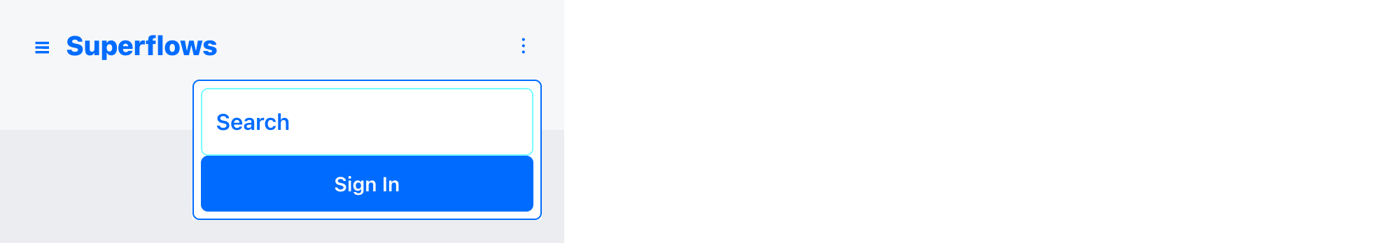
Step 2 - Set the Search Input Caption
To change the search caption, set the searchCaption prop to the appropriate string value, as shown:
return (
        <div>
                <SfNav searchCaption="Find" />
        </div>
);
It renders as follows:


Step 3 - Set the Search Input Icon
You can also add an icon to the search input. Simply set the searchIcon prop to the icon object. The icon object can be taken from any library. In the example below, I have used the bootstrap icons library:
To change the search caption, set the searchCaption prop to the appropriate string value, as shown:
npm install react-bootstrap-icons
import {Search} from 'react-bootstrap-icons';
return (
        <div>
                <SfNav searchIcon={<Search />} />
        </div>
);
It renders as follows:


Step 4 - Handle the Callback
The navigation bar returns a callback if the user enters some text in the search input and presses enter. You can subscribe to this callback by subscribing to the onSearchPressed prop, as shown:
return (
        <div>
              <SfNav onSearchPressed={(value) => {alert(value)}}/>
        </div>
);
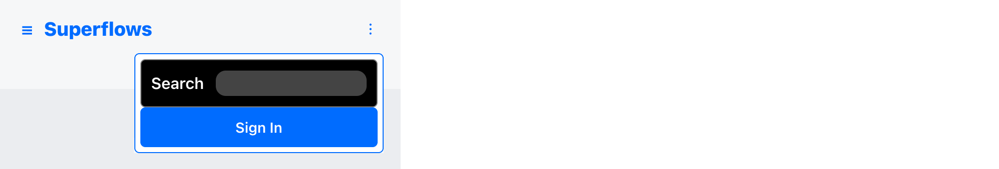
Step 5 - Styling
You can then customise the look and feel, by using inline css or by class names. The Superflows navigation bar exposes props that facilitate customisation. An example is shown below:
return (
        <div>
              <SfNav
                  stylesSearchContainer={{backgroundColor: 'black', color: 'white', border: 'solid 1px gray'}}
                  stylesSearchInput={{backgroundColor: '#444', borderRadius: '10px', color: '#efefef', paddingTop: '5px', paddingBottom: '5px'}}
              />
        </div>
);
It renders as follows:

Reference Links
Documentation
Example Project For This Tutorial
Previous Tutorials of Navbar
YouTube Channel
Discord Community
Example Projects Collection
Video Tutorial
Further Reading
You have already seen how to get started with the navigation bar, how to insert brand information into it, how to customise the menu and now, how to configure the search input. The next tutorial will show you how to use and customise the sign in button.
Conclusion
This article shows you how to configure the search input. How to show / hide it, how to change the caption, how to add an icon, how to handle callback and how to customise and style it.