


Table of contents
Introduction
This article shows you how to add notifications your react navbar. It shows you how to show / hide the notifications feature, how to set recent notifications, how to change the bell icon, how to listen to callbacks and how to do further styling.
Prerequisites
This article assumes that you have read the previous navbar tutorials. In case you haven't you will find a consolidated list in the reference links section. This article assumes that you have installed the Superflows library, have the default navigation bar up and running, have added your brand information, have also customised your menu, have added the search input, have configured the sign in button, have understood how to insert user profile information into the navbar and have seen how to add a back button to the navbar. This tutorial takes it forward from there.
Step 1 - Display the Notification Section
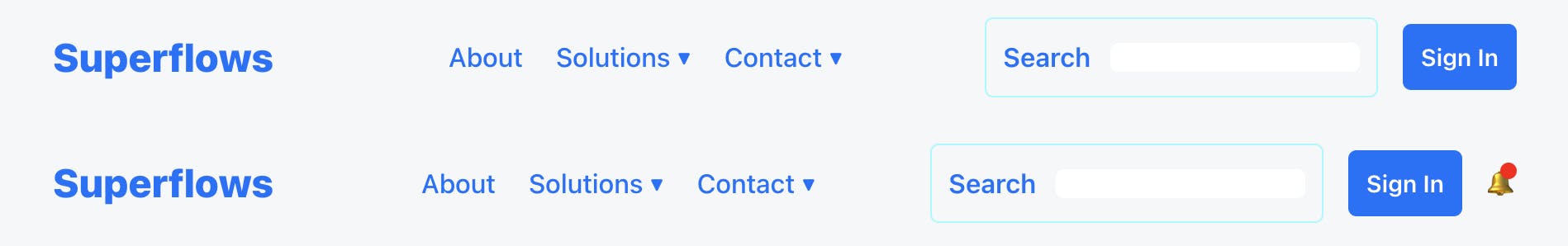
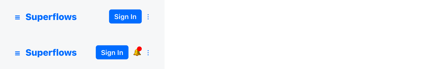
By default notifications are visible. To show them, set the showNotification prop to true. You will see that the notification bell is now visible. Go ahead, click on it! A notification list will drop down. This is the default list, you can of course change it.
function Apps(props) {

    return (
        <div>
            <SfNav />
            <br />
            <SfNav showNotification={true}/>
        </div>
    );
}
It renders as follows:
Step 2 - Customize the Notification List
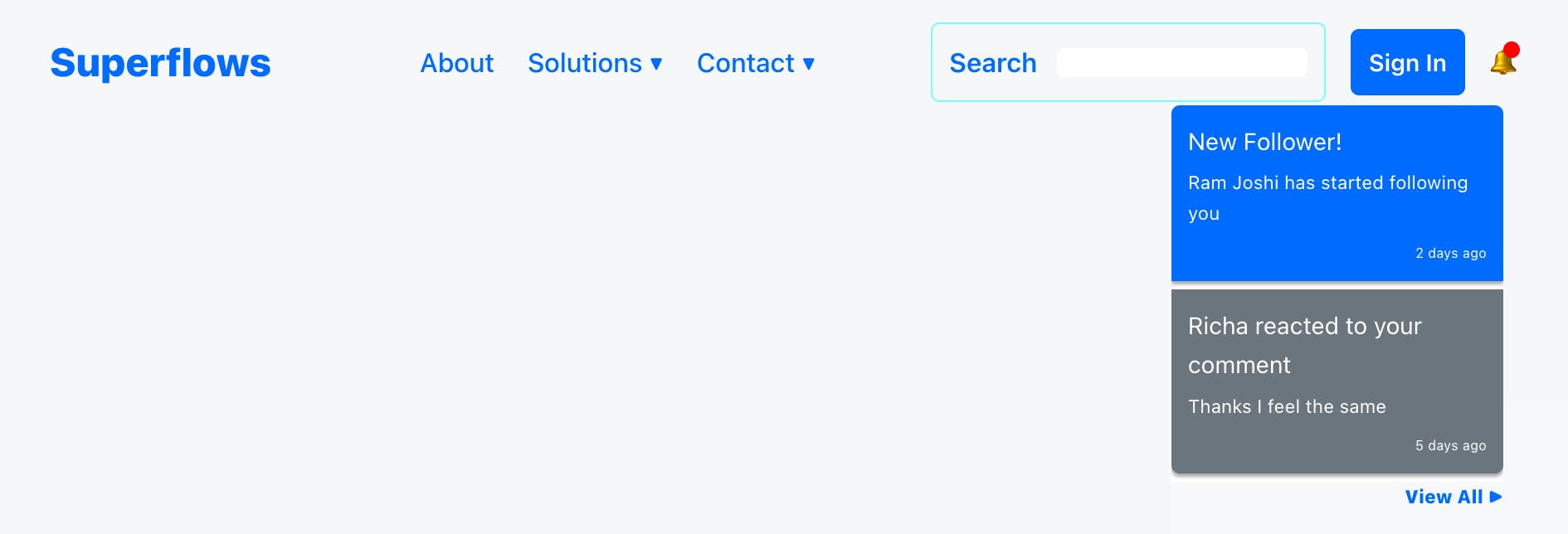
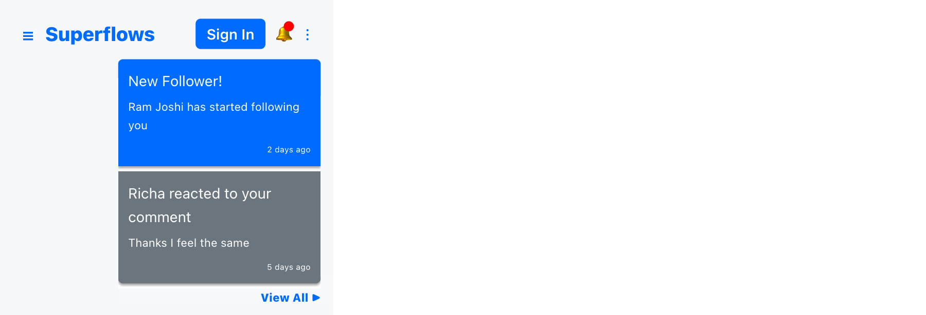
The notification list can be customized by passing a json array to the notificationList prop. Look at the example below.
function Apps(props) {

    return (
        <div>
            <SfNav showNotification={true} notificationList={[
                {id: 1, title: "New Follower!", description: 'Ram Joshi has started following you', timestampReceived: "2 days ago", read: false},
                {id: 2, title: "Richa reacted to your comment", description: 'Thanks I feel the same', timestampReceived: "5 days ago", read: true}]} />
        </div>
    );
}
It renders as follows:
Step 3 - Change the Bell Icon
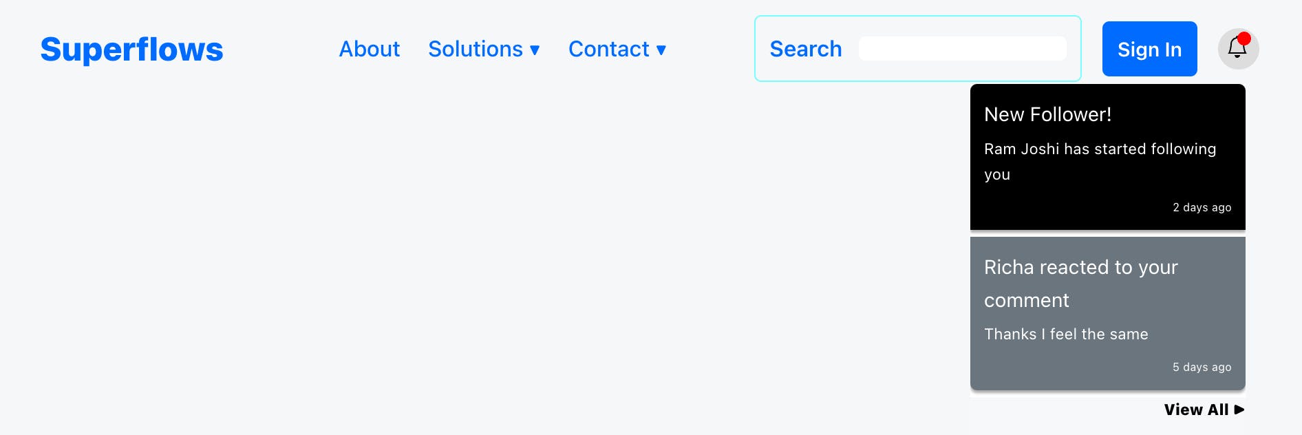
The default bell icon is from the unicode character set. You can use any icon and icon library of your choice. To change the bell icon, pass your icon object to the notificationIcon prop.
import {Bell} from 'react-bootstrap-icons';
function Apps(props) {

    return (
        <div>
            <SfNav showNotification={true} notificationIcon={<Bell style={{marginTop: '5px'}}/>} />
        </div>
    );
}
It renders as follows:


New Notification Indication
If the notification list contains an unread notification, a red badge notification indicator will be shown on the notification icon. If all the notifications are read, it is not shown.
Step 4 - Listen to the Notification Click Callback
Subscribe to the onNotificationClicked prop to listen to the notification click events.
function Apps(props) {

    return (
        <div>
            <SfNav showNotification={true} onNotificationClicked={(value) => {alert('Clicked on notification: ' + value.title)}} />
        </div>
    );
}
Step 5 - Listen to the View All Click Callback
Subscribe to the onViewAllClicked prop to listen to the view all button press event.
function Apps(props) {

    return (
        <div>
            <SfNav showNotification={true} onViewAllNotificationsClicked={() => {alert('On View All Clicked')}} />
        </div>
    );
}
Step 6 - Styling
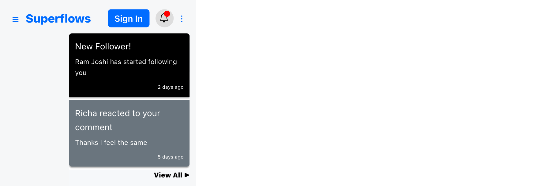
If you are interested in obtaining complete control over the look and feel, you already have it. You can completely override the base css properties of the notification elements according to your requirements. Showing you an example below.
function Apps(props) {

    return (
        <div>
            <SfNav
                showNotification={true}
                onViewAllNotificationsClicked={() => {alert('On View All Clicked')}}
                notificationList={[
                    {id: 1, title: "New Follower!", description: 'Ram Joshi has started following you', timestampReceived: "2 days ago", read: false},
                    {id: 2, title: "Richa reacted to your comment", description: 'Thanks I feel the same', timestampReceived: "5 days ago", read: true}]}
                stylesNotificationIcon={{backgroundColor: '#ddd', color: 'black', height: '30px', width: '30px', justifyContent: 'center', borderRadius: '15px'}}
                stylesNotificationUnRead={{backgroundColor: 'black'}}
                stylesNotificationViewAll={{color: 'black'}}
                notificationIcon={<Bell style={{marginTop: '5px'}} />}  />
        </div>
    );
}
It renders as follows:
Reference Links
Documentation
Example Project For This Tutorial
Previous Tutorials of Navbar
- T1: Getting Started With Navbar
- T2: Insert Brand Info
- T3: Customise Menu
- T4: Add Search Functionality
- T5: Add Sign In Button
- T6: Add User Profile Info
- T7: Add Back Button
YouTube Channel
Discord Community
Example Projects Collection
Video Tutorial
Conclusion
You have already seen how to get started with the navigation bar, how to insert brand information into it, how to customise the menu and now, how to configure the search input, how to use the sign in button, how to insert profile information into it, how to add a back button and now how to add notifications to it.
This article shows you how to show the notifications section, customize the icon & notification list, listen to callbacks and how to style it.